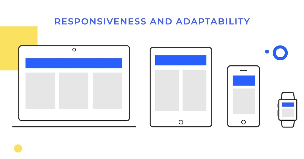
In today’s mobile-first digital landscape, having a responsive website is no longer optional. Users expect seamless experiences across all devices, from smartphones to tablets to desktop computers. However, even well-designed websites can develop unresponsive layout issues that frustrate users and hurt search rankings. Professional web development companies like Hawaii Web Studio understand the critical importance of maintaining responsive designs that adapt flawlessly to different screen sizes.
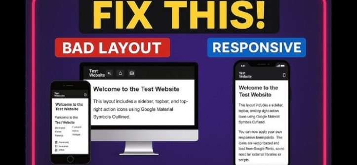
An unresponsive layout occurs when your website fails to adapt properly to different screen sizes or device orientations. This problem can manifest in various ways, from overlapping elements to content that appears too small or too large on certain devices. Therefore, understanding how to identify and resolve these issues is essential for maintaining a successful online presence.
Modern users abandon websites quickly when they encounter layout problems. Additionally, search engines like Google prioritize mobile-friendly websites in their rankings. Consequently, fixing unresponsive layout issues should be a top priority for website owners and developers.
Common Signs of an Unresponsive Layout
Identifying layout responsiveness issues requires careful observation across multiple devices and screen sizes. Several telltale signs indicate when your website’s layout is not responding properly to different viewing environments.
Horizontal scrolling on mobile devices represents one of the most obvious indicators of layout problems. When users must scroll sideways to view content on their phones or tablets, it clearly signals that your layout is not adapting correctly. Furthermore, text that appears too small to read without zooming indicates poor responsive design implementation.
Overlapping elements create another clear sign of unresponsive layouts. Navigation menus that overlap with content, images that extend beyond their containers, or text that covers other page elements all point to responsive design failures. Similarly, buttons or links that become too small to tap comfortably on touch devices indicate layout issues that need immediate attention.
Content that disappears entirely on certain screen sizes represents a critical responsive design failure. Additionally, images that don’t scale properly or maintain incorrect aspect ratios across devices signal layout problems that can significantly impact user experience.
Essential Tools for Identifying Layout Issues
Modern web browsers provide powerful built-in tools for testing responsive layouts. Chrome DevTools, Firefox Developer Tools, and Safari Web Inspector all offer device simulation features that allow you to test your website across various screen sizes without needing multiple physical devices.
The device toolbar in Chrome DevTools enables you to simulate different devices and screen resolutions quickly. However, remember that browser simulations cannot perfectly replicate real device behavior, so testing on actual devices remains important for comprehensive evaluation.
Browser extensions like Responsive Viewer and Window Resizer provide additional testing capabilities. These tools allow you to view your website at multiple screen sizes simultaneously, making it easier to spot inconsistencies and layout problems across different breakpoints.
Online testing platforms such as BrowserStack and Sauce Labs offer access to real devices for more accurate testing. Additionally, these services provide automated screenshot generation across multiple devices, helping you identify layout issues more efficiently.
Step-by-Step Debugging Process
Begin your debugging process by testing your website on actual devices whenever possible. Start with the most common screen sizes and gradually work your way through various breakpoints to identify where layout issues occur.
Document all observed problems with screenshots and detailed descriptions. Note the specific screen sizes, device types, and browsers where issues appear. This documentation will prove invaluable when implementing fixes and verifying that problems have been resolved.
Use browser developer tools to inspect problematic elements. The element inspector allows you to examine CSS properties in real-time and identify conflicting styles or missing responsive rules. Pay particular attention to width, height, padding, and margin properties that might cause layout problems.
Test your website’s layout in both portrait and landscape orientations on mobile devices. Many responsive design issues only become apparent when users rotate their devices, so thorough testing across orientations is essential for comprehensive debugging.
Common Causes and Solutions
Fixed width elements represent one of the most frequent causes of unresponsive layouts. When elements have fixed pixel widths instead of relative units like percentages or viewport units, they cannot adapt to different screen sizes. Replace fixed widths with flexible alternatives like percentages, em units, or CSS Grid and Flexbox properties.
Inadequate CSS media queries often contribute to layout responsiveness problems. Ensure your stylesheet includes appropriate breakpoints for all target devices. Additionally, verify that media query ranges don’t have gaps that leave certain screen sizes without proper styling rules.
Images without proper responsive attributes frequently cause layout issues. Implement the max-width: 100% and height: auto CSS properties on images to ensure they scale appropriately. Furthermore, consider using the HTML picture element and srcset attribute for more advanced responsive image solutions.
Overflowing content presents another common responsive design challenge. Use CSS overflow properties strategically and implement text truncation or scrollable containers when necessary. However, avoid horizontal scrolling as it creates poor user experiences on mobile devices.
Advanced Responsive Design Techniques
CSS Grid and Flexbox provide powerful tools for creating truly responsive layouts. These modern layout methods automatically adjust to available space and eliminate many traditional responsive design challenges. Therefore, consider migrating older float-based layouts to these more flexible alternatives.
Container queries represent an emerging CSS feature that enables more precise responsive design control. Unlike media queries that respond to viewport size, container queries respond to the size of specific containers within your layout. This technology offers more granular control over responsive behavior.
Viewport units (vw, vh, vmin, vmax) provide another advanced technique for creating responsive layouts. These units scale relative to the browser window size, enabling more dynamic and fluid designs. However, use viewport units carefully as they can cause accessibility issues if not implemented thoughtfully.
CSS custom properties (variables) can improve responsive design maintainability. By defining responsive breakpoints and spacing values as custom properties, you can make global adjustments more efficiently and maintain consistency across your entire layout system.
Testing and Quality Assurance
Establish a comprehensive testing protocol that covers all target devices and screen sizes. Create a checklist that includes common responsive design elements like navigation menus, forms, images, and content sections. Additionally, test your website’s performance on slower connections and older devices.
Automated testing tools can supplement manual testing efforts. Tools like Lighthouse and PageSpeed Insights evaluate responsive design compliance and provide actionable recommendations for improvement. However, remember that automated tools cannot replace human evaluation of user experience quality.
Regular testing should become part of your ongoing website maintenance routine. Set up monitoring alerts for layout issues and conduct periodic responsive design audits to catch problems before they impact users. Furthermore, stay informed about new device releases and screen resolutions that might affect your layout.
User feedback provides valuable insights into real-world responsive design performance. Encourage users to report layout problems and monitor analytics data for signs of poor mobile user engagement. This feedback helps identify issues that might not appear during formal testing procedures.
Prevention and Best Practices
Adopt a mobile-first design approach to prevent many responsive layout issues from occurring. Start designing for the smallest screen size and progressively enhance the layout for larger devices. This methodology ensures that your core functionality works well on all devices.
Use relative units instead of fixed pixels whenever possible. Percentages, em units, rem units, and viewport units all provide better flexibility for responsive designs. Additionally, implement flexible grid systems that can adapt to different screen sizes automatically.
Optimize images for responsive delivery using modern formats like WebP and AVIF. Implement proper responsive image techniques including srcset attributes and the picture element. Furthermore, consider using CSS object-fit properties to control how images scale within their containers.
Regular code reviews should include responsive design evaluation. Train team members to recognize common responsive design anti-patterns and establish coding standards that promote responsive-friendly development practices. Therefore, prevention through education and standardization often proves more effective than reactive debugging.
Read More Also: 10 Best Field Service Management Software Tools
Conclusion
Identifying and fixing unresponsive layouts requires systematic testing, careful analysis, and implementation of modern responsive design techniques. By using the right tools and following established debugging procedures, you can ensure your website provides excellent user experiences across all devices.
Remember that responsive design is an ongoing responsibility, not a one-time task. Regular testing, monitoring, and maintenance help prevent layout issues from impacting your users and search engine rankings. Additionally, staying current with evolving web standards and device capabilities ensures your responsive designs remain effective over time.
Success in responsive web design comes from understanding both the technical aspects of layout implementation and the user experience implications of design decisions. Therefore, always prioritize user needs while implementing technically sound responsive design solutions.
Read More Also: Puma Affiliate Marketing Program
Frequently Asked Questions
What is the difference between responsive and adaptive web design?
Responsive design uses fluid grids and flexible elements that continuously adjust to any screen size, while adaptive design uses fixed layouts for specific breakpoints. Responsive design provides a more seamless experience across all devices.
How many breakpoints should I include in my responsive design?
Most websites work well with 3-4 major breakpoints: mobile (up to 768px), tablet (768px-1024px), and desktop (1024px+). However, the exact number depends on your content and user analytics data.
Why does my website look different in browser testing tools versus real devices?
Browser simulation tools provide approximations of device behavior but cannot perfectly replicate hardware-specific rendering, touch interactions, or performance characteristics. Always test on real devices for final validation.
Can unresponsive layouts affect my search engine rankings?
Yes, Google uses mobile-friendliness as a ranking factor. Websites with poor mobile experiences may rank lower in search results, particularly for mobile searches. Responsive design is essential for SEO success.
What should I do if my website was built with an older, non-responsive framework?
Consider upgrading to a modern responsive framework or rebuilding key pages with responsive techniques. Alternatively, implement responsive CSS overrides to address the most critical layout issues while planning a more comprehensive update.


Leave a Reply